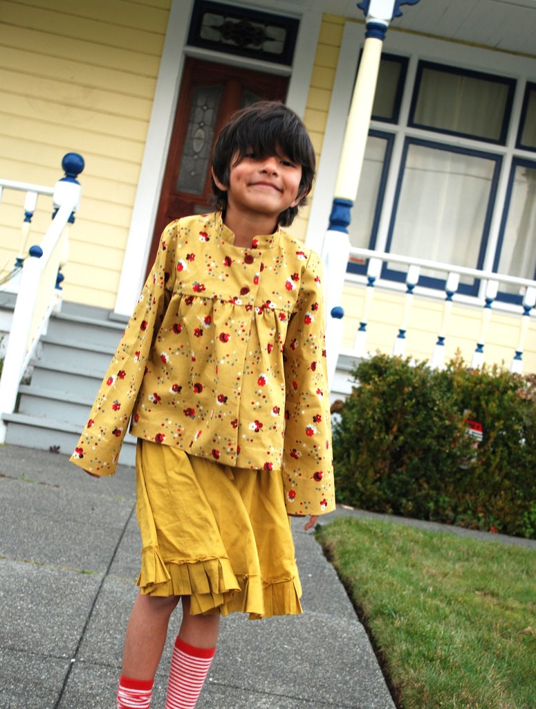
 This Sunday Brunch jacket, made by June Beetle and found on our Flickr group, demonstrates the “see the child first” principle nicely. The colors and print are flattering without being overpowering. And that muted yellow looks terrific on her!
You undoubtedly know by now that Oliver + S designs feature classic, simple styling with clean lines and not a lot of unnecessary ornamentation. By designing this way, I’m trying to create beautiful clothing that doesn’t call attention to itself but that highlights the charms of the child who is wearing it. When I select fabric, I go for the same effect.
There’s been a trend in the quilt industry over the last several years toward very bold, busy, colorful prints. Many prints today are actually printed in 10 or more vibrant colors. While I like some of these prints, I tend to shy away from the loudest, boldest, most colorful ones when I make Oliver + S garments. A lot of these prints, when turned into dresses or tops, scream “Look at me! I’m a print by Designer X!” I don’t necessarily want to dress my child—or anyone’s child—as a walking billboard for a fabric collection or designer of the moment. When you dress a child in a garment made from a very busy fabric, you run the risk that the child will get lost behind the print. (And if you combine two or more of these prints in a single outfit…well, it’s all exponential, isn’t it?)
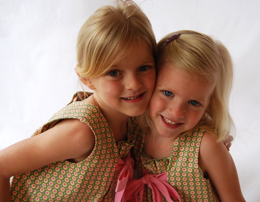 I’d be willing to bet that you noticed these two adorable sisters before you saw their sweet matching Birthday Party dresses, yes? Dresses by A.J.Jacks, one of our Boutique Sewer Program participants.
I also worry that many of these bright, bold prints won’t age very well. We all have some cringe-worthy photos of ourselves as children, don’t we? Take a closer look at one of those photos. Chances are the clothing hasn’t aged well because the styling of the garment or the print of the fabric is overly complicated or very “of the moment.” In designing Oliver + S garments, I’m consciously trying to achieve a timeless style. When viewed two decades from now, a 2009 photo of a child wearing an Oliver + S design shouldn’t cause anyone to say, “What is that you were wearing?” or “What was your mother thinking, dressing you like that?” (I can say this from experience because I have plenty of photos of myself from the 1970s that elicit just those sorts of comments. What was it with those purple bell-bottom jeans with the silver rivets down the legs?) Rather, someone should say, “Hey, you were a really cute kid.”
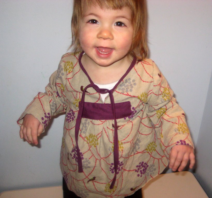 The beige ground and clear-but-muted plum, mustard, and other colors in this 2 + 2 Blouse look wonderful on a toddler. Sewn by Angela Maureen.
So when I’m selecting fabrics for making my own Oliver + S garments, I tend toward the more subtle and sophisticated prints. Although it goes against the grain of a lot of what’s being done today in the home sewing industry, I think subtle and sophisticated work exceptionally well for children’s clothing. The fabrics don’t have to be loud and bright to capture people’s attention. I would rather let people notice the clothing after they see the child wearing the garments.
I think you’ll also notice that high-end designers are using more subtle and sophisticated prints these days. And this isn’t to say that we need to be afraid of color. I love color, and I’ll talk more about it when I discuss some of my other fabric selection principles in future posts.
In a nutshell … well said!
Thank you for this series. I love to sew, and I love fabric. But, I often have trouble visualizing a fabric made up into a pattern. I love looking at your site for inspiration, so I can’t wait to learn more about how you choose your fabrics.
This is one of those posts where I read then walk away feeling like my mind hurts from the knowledge it learned… and how to apply it.
I liked this. A lot.
Thank you for the fantastic advice, I am just getting started with making a few children’s garments and the timing of this series could not be better.
Oh thank you thank you for coming out and saying this! I recoil from so many of the loud fabric prints especially when I see them used in children’s clothing. Hello! sense of scale please!
Being petite I have to remember this for myself too–that a print needs to be proportionate to the one wearing it.
I truly like your statement about being able to see the child first before the clothes. That is quite humble, since you are the designer, and yet you do not want the attention first. You have serving the child in your heart.
thanks for your beautiful patterns and insightful blog.
Well said. I find the colors to be wonderful, but the loud prints are just way too much for children.
i have to say, these are the very reasons i love to look at your patterns and the fabrics you choose for them! the are beautiful in their simplicity and certainly work to highlight the little darling wearing them instead of commanding the spotlight themselves. so many of the boutique children’s clothing, especially for little girls, tends to shout “look at me!” with ruffles, large prints, etc., when really i just want everyone to look at my beautiful little girl!
all that to say, can’t wait for more! 🙂
Brilliant! This is exactly how I feel about creating children’s clothing. I like things to be subtle so you see the child first. And in all the photos in this post you most definitely notice the adorable children before you see the outfits. As it should be.
It also might be helpful if you showed us the wrong way to do it. So we can really compare the two!
Liesl,
Nice talking to you today. I like the concept and the clothes look great, or, I should say, the kids look great. I’ll call Todd tomorrow.
Clark
So True! I wish I had read this several months ago and given it some thought then.
I just made up two tea party dresses for my girls in very loud quilting prints. They are lovely dresses, but my daughters are overwhelmed in them. I love bright colours and while I wouldn't wear them myself, I thought I could get away with it because they were children. Not so!