I’ve been dreading this blog post because it means we’ve come to the end of my Principles of Fabric Selection series. But I know many of you have been waiting to hear what I have to say on this topic, so here we go.
Juvenile prints are a subset of the larger print category known as conversational prints, or prints with pictures in them. They are intended to appeal to a young person and often feature animals or toys. Juvenile prints are cute and appealing and seem to be frequently used by home seamstresses, maybe because they are so different from prints typically found in ready-made clothing.
I like juvenile prints. I just don’t like them to be very juvenile. I like little robots and flowers and animals and things as long as there’s some degree of sophistication to them. (There’s that word–sophisticated–again.)
The Japanese fabric companies seem to handle this well. They print on unbleached linen or on a solid background. The prints are small and spare with lots of empty space around the images. And in general the prints aren’t powder pink, baby blue, or filled with loads of vibrant primary colors that compete with each other for your attention.
I also like Heather Ross’s designs (disclosure: Heather is a friend in addition to being a talented illustrator and designer) because although they’re filled with brilliant colors, the palettes are sophisticated (i.e., not just primary colors) and the images are a little quirky rather than being saccharine sweet. Just like Heather. (Just kidding, Heather. Or maybe you would take that as a compliment….)
So let’s say you fall in love with a particular juvenile print and really want to use it. What’s the best way to sew clothing that doesn’t overpower the child or overwhelm the viewer? Well, all those other principles of fabric selection we’ve already discussed can help. You might pick a solid or neutral color to pair with the print to help tone it down a bit, or find a small supporting print from another fabric collection that enhances it. Here are a few examples from the Oliver + S Flickr group that I thought handled juvenile prints especially well.
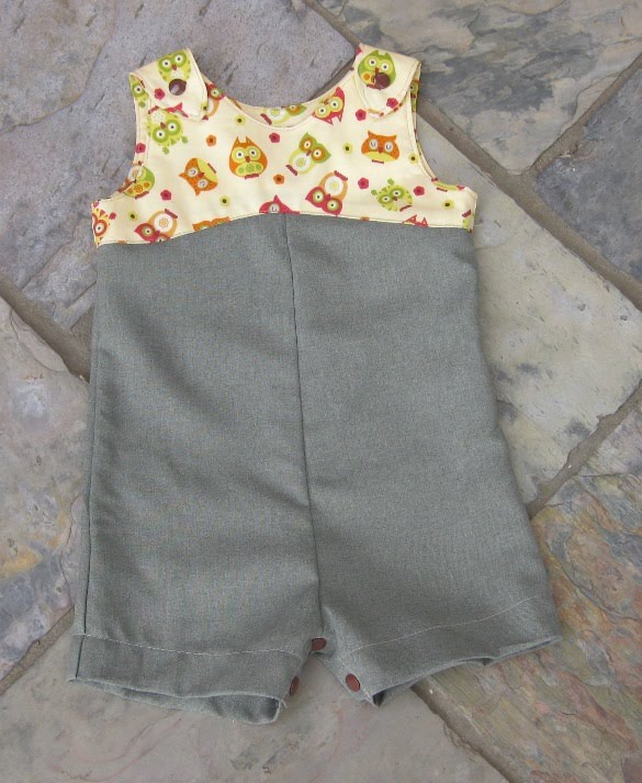 This owl print is used in just a small quantity and, paired with the gray solid, provides a nice touch of whimsy that doesn’t overpower.
 Heather’s matryoshka dolls are cute on a brown ground, and I love the black and white gingham ribbon at the hem of this Lazy Days skirt. Very sophisticated.
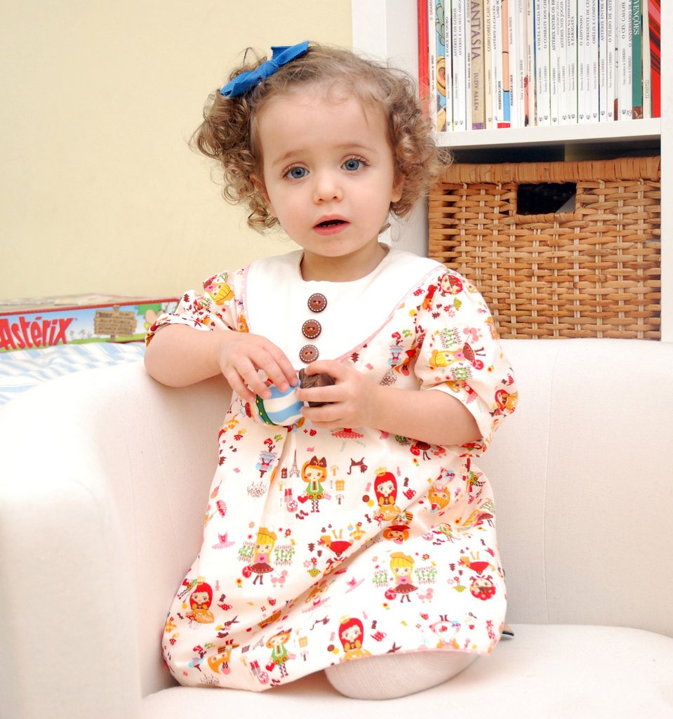 While this Japanese print might otherwise overwhelm, I think this dress is successful because there is plenty of white space around around the characters, and the white bib with elegant brown buttons helps to frame her darling little face. (Note that this print definitely works best on younger children like this little sweetie!)
 Here is another Japanese print that’s been paired with a red and white gingham for great effect. Cute, right?
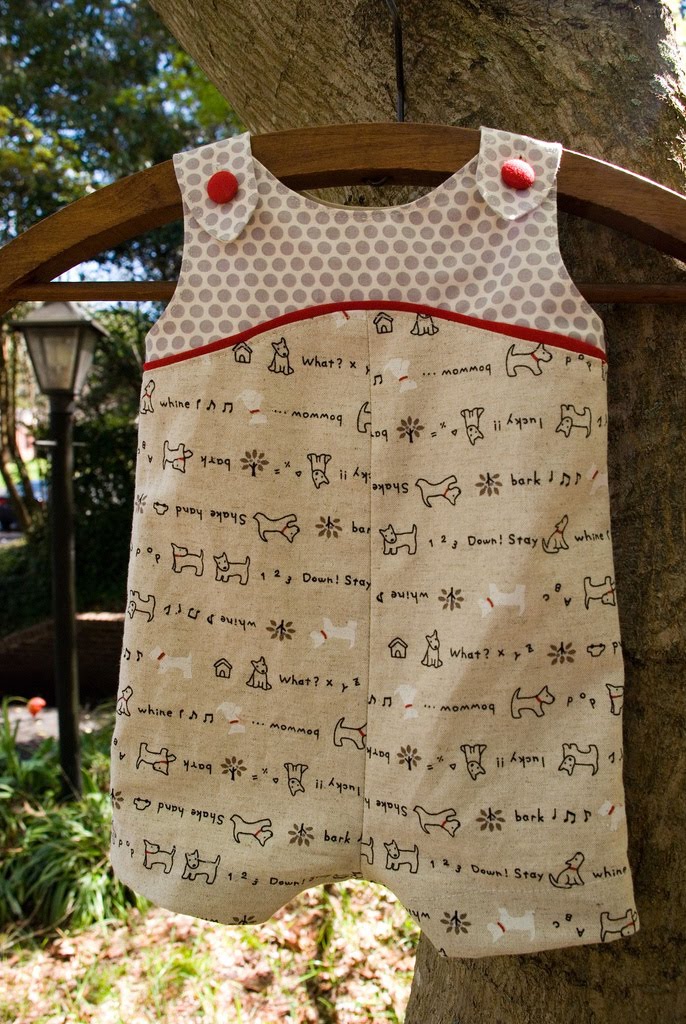 This is a subtle juvenile print on an unbleached linen/cotton ground. (Oh, those fabulous Japanese fabric companies!) I love how this one is paired with a subtle neutral-patterned print on top, and the red piping and buttons give this Tea Party Playsuit its pop of color while tying the prints together. It’s very successful.
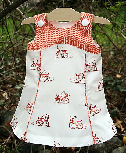 Plenty of white space between these Heather Ross bicycles, and I love the way the piping continues the small-scale pattern from the dress yoke. This is really a wonderful dress.
 Using this Heather Ross print for the entire dress would not have occurred to me, and I think it’s especially successful because of the solid piping. I really love this one.
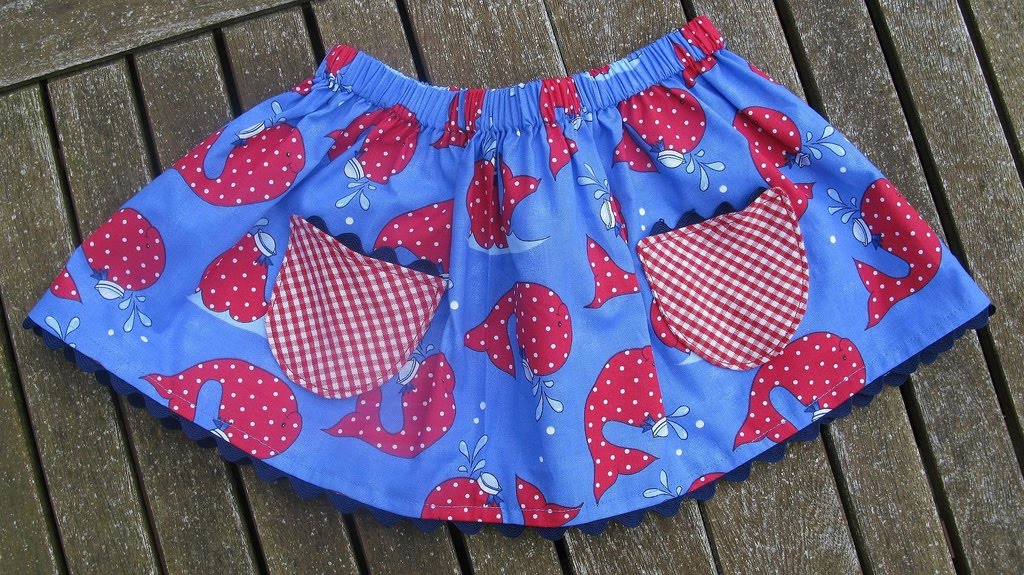 This preppy whale print verges on overwhelming, but the small size of the skirt combined with the ric-rac trimmed gingham pockets somehow rescues it, and I love it for that. This is such a fun summer skirt that could be worn with a simple white top and red sandals.
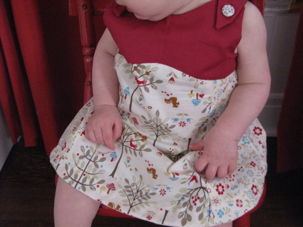 I really like how the dark red yoke of this Tea Party Sundress picks up the tiny bits of red in the print.
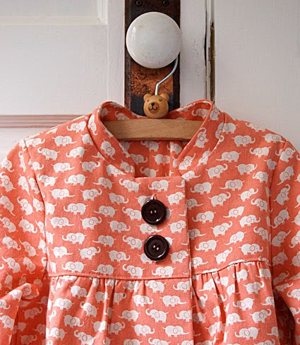
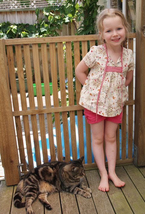
The playful elephant print looks great because it’s limited to two colors. I like the combination of a fun print with the more grown-up Sunday Brunch jacket.
And by the way, this principle does not apply to PJs. When it comes to sleepwear, anything goes!
Soooo adorable!
You bring up such a great point! I love juvenile prints and have made a few things from them for myself. I do find them somewhat overpowering and too childish for my look. Its hard not to use these fabrics and so I think pairing them in the ways you have shown is a perfect solution. Love it!
Thanks for linking my skirt, I feel famous! Great lessons in this post, and fun to see all the other great examples.
http://www.saraisabee.com
http://www.etsy.com/shop/saraisabee
Love this series on fabric selection… and I think a lot of these principles apply to adult clothing as well. Very helpful.
OH, I was so nervous! 😉 Everything you said is exactly as I expected you to say them – perfectly helpful! Thanks again, Liesl for such wonderful tutelage.
Very helpful as always, Liesl! Thanks so much! And I just love all the examples.
As a busy (very) working mother of 3, learning to sew (last year by trial and error) allowed me to find my own pace and regain a loss family tradition of sewing handmade garments for our kids/loved ones. I’m quite classic and contemporary in my fashion choices, but there are really too much fabric options for children's garments!! So, every time I select a fabric and pattern for my children (O+S are my faves for obvious reasons: simple, accurate, contemporary, …) I rely on your “Principles of Fabric Selection” (an excellent crash course) . That’s what happened with the “Japanese princess” fabric above! I found the print so amazing that I bought it even before learning how to sew. Then, after my 2nd Playdate dress, I knew I needed to give this fabric a change: I loved the result (it really looks very age-appropriate as she is so little) and learn a lot with the experience. Thanks! I do hope to continue to learn more from you and the fantastic network of O+S members!
Thanks for linking my Sundress as well..it's so nice when the designer like yourself mentions something lovely like that. This post is timely too as I'm just about to make an outfit with the sailboat top & pants for a boy, & am deciding what to do for fabric choice. This has always been the hardest in sewing for me as there is so much choices out there.
Thanks for linking to my 2+2 shirt, I'm enormously flattered! The bonus of using your patterns for these kinds of prints is that they're very simple and tone down the busyness of the fabric. I've admired some of your other examples in the Flickr group, I'm always amazed by the gorgeous clothes people are producing!
where are the other principles of fabric selection posts? I can't see how to go to earlier entries on your blog.
got here from Spoonflower
You'll be able to see all of them by clicking on the Label "principles of fabric selection" that appears at the bottom of the post.
Thanks for a great post! I've been a bit nervous about cutting into my Japanese prints to sew some Oliver & S patterns for my little girl, worried I'd be overdoing it with the prints. Now I can cut away in confidence 🙂
Very informative, so glad I happened upon this! New to designing fabrics, I'm appreciative for this post!
Glad to see some of my preferences validated. Even in quilts I use only a smattering of juvenille prints as focus prints. And I use lots of Japanese, juvenille, and other types of wild prints in everyone's jammies!